Showing posts with label OUGD504. Show all posts

Friday, 9 January 2015

OUGD504 Module Evaluation Semester 1

This semester have been a great discovery for me. I tried to adapt myself the most as possible into the way of working. at first I was amazed by one-week briefs because I was not used by these delays. However I enjoyed that and I was surprised myself by my capability to work quickly. I also liked the crits groups. It's really interesting to see and discuss about the others' work.

Among the four briefs I've done though this semester, I preferred "A brief history of…" one. I was not sure to find a good concept in so far as I didn't make the Summer Brief. Finally I thought I would be challenging to design a video content website. It was a real opportunity to achieve this kind of work as I was used to do only printed ones. The thing I enjoyed the most was testing my skills on AfterEffects. Indeed I learned the basis of this software a long time ago and I wanted to make the animation of my website. I was impressed by the result and happy to have done it, I could not coding because I have very little knowledge about this field.

Then I enjoyed workshops which helped me in different tasks during all this semester. To conclude this semester brings me a very impression and I learned more about myself, my way to work. The briefs I accomplished allowed me to improve my skills in software and opened me many opportunities in different fields of graphic design.

Evaluations Semester 1

Brief 01 My Design Process

This was my first design fully in English. At first I was a little bit lost because I didn't know how to approach the way of working. Hopefully my classmates explained me a lot about blogging and everything I wanted to know. This short brief allowed to me to see and start my Level 05 year. At the beginning, the brainstorm session helped me define my own design process, which I never thought about before. I can notice how it was important and how many ways it can be considered. The other thing I enjoyed to try is folding paper. I tested difficult ones but I failed many times and I found that the simplest would be the clearest. Thus I created a simple form but I had to find a thing that would make the originality of my leaflet. So I tried a pop-up list. With the crit session I get the idea to take different types of paper, like tracing paper in order to create an illusion with layers. After having printed and folded my leaflet, I was really happy of the result. I was comforted with this as I gat some good feedback from my classmates. If I had to change something in my work, I would follow more the flowchart I've done at the beginning because the questions I asked was more interesting than the final list I made. I liked to see the work of the others, there were some good ideas and above all I liked to discover the English way of work which is unlike the French one.


Brief 02 Logostarter

I encountered difficulties for starting this project. I used to know and visit Kickstarter website and I think it's a really interesting way to help and finance fresh start-ups. But this time, it was hard to find a project that I'm pleased with. Moreover, the task seemed to me a little bit trouble because we had to create and define a visual identity for our chosen project but most of the projects I liked had already a good communication. So I decided to turn towards architecture projects which needed the creation of an identity. I chose the Haven House one, because I found the idea truly innovative. I stopped my research and started to find concepts for the logo. Before that, I did some research about the project and I realized that's a pretty old one but it never really worked. Then I asked myself about the reasons of this non-success and maybe it's because the communication didn't work at the past and so now. The website, the logo, they are some proofs that there were things to improve. After having analysed this, I had to find the best communication supports and I thought about the website (it was obvious) and a business card. I guess I could have done a leaflet if time had permitted me. Finally, I really like the design I've made during this short term. To conclude, this brief allowed to me to identify all problems we can encounter by planning a delivery for a client. Most of the time, there are constraints that we have to follow.

Brief 03 A brief history of…

This project introduced me how to design a website which I've never done before. I was barely anxious because I used to make design for print and coding was a huge task to approach. Hopefully when I saw I was in the same case as everybody I felt relieved. However I needed to learn more about this field. With the different tasks I've done, I see how many settings I've to take account for the elaboration of a website of a website. That reinforced me to design my own website. Thinking about a process which is different from video websites like YouTube was not easy. The purpose to viewers a choice between a random function and a selection mode. I wanted a simple template because the video and text content is enough. One of my classmates told me it looked like the Vine website because of the green and grey colours I took for this. Perhaps I had have to use another colour… but I was feeling quite proud by the ones I chose. Finally, I tried to code my website. Unfortunately I missed the workshop about that and I looked for tutos on the Internet, that was a big deal and I had not enough time to do it correctly. I preferred instead to make a little animation to explain how it works. At the end, I'm happy for having done this project. This allowed me how a website works and all the skills it involves. This made me want to continue in this way and it showed me all creative possibilities I can use and develop.

Brief 04 Augmented Design

This advertising brief has caused me some challenges but I'm happy to have been confronted with. It was not easy to make something realisable as my content was not really precise. I had only my logo and visual identity from my website and unfortunately no images except those extracted from videos. I was feeling struggled with that but finally I've found a concept: make my campaign like a game. I think people loves mysterious things so I decided to make it with an interactive tone. For the poster, I wanted a small one so people could put their smartphone on the black part and take their time to discover the website. The flyer and the stickers were made for a direct link to the network (there they get a random video like the eye concept of the homepage). On one hand I'm little bit disappointed of myself because I would have liked to do more designs for poster and flyer based on the same principle. On the other hand the hardest task for me was to familiar with the problem of cost, distribution and time-frame. I did the bast I can do for communication strategy by thinking about and like the audience. Eventually I helped myself by searching on the Internet inspiration and tips for improving that. As a conclusion, I thought it was the most difficult project I dealt with during this semester. By the way I'm aware that I didn't take enough time to make the best of it and I can feel it in designs I've done. Therefore that proves me that advertising demands a lot of process for finding the perfect concept.

Tuesday, 6 January 2015

OUGD504 Brief 04 Augmented Design - Study Task 11

☞ Project Rationale

- Purpose/reason of the campaign : The reason of my website campaign is to let know people that it exists and let draw them to watch the videos.

- Audience/Message/Tone of voice :


Format : printed advertising campaign (bildboards, magazines, newspapers…) with augmented design dimension.

Materials & Budget : Paper, Digital supports : my objective for this brief is to make 3 supports : a little poster, a flyer and a sticker which would be dispatched.

Flyer

Poster

Stickers

Total price is about £200 for the whole communication.

Placement/distribution : I still believe that public areas placement would be great : streets, restaurants, subways, etc. I have to target my audience but there's a possibility that other people could be interrogated and interested by the concept.

Must do's : be funny ; attract viewer's curiosity

Must not's : use video extract ; be too explicit

Time-frame : as the purpose is to reveal the existence of my website for launching it, I think there's no need to make my campaign last. The ideal time-frame in my view would be 2 months. This is enough for being seen by the audience which tends to zap information quickly.

Thursday, 18 December 2014

OUGD504 Brief 04 Augmented Design - Study Task 13

Print Finishes

There are many creative possibilities for print :

Varnishes


A varnish is a liquid shellac or plastic-like put on a printed piece like a layer or clear ink, varnish adds a glossy, satin or matte finish. Part of the printing or finishing process, varnish is applied like a final layer of ink after a piece is printed. It may be clear or tinted.
Glossy finish

Matte finish

Spot varnish
This is a special effect that puts an overprint varnish only on specific areas of a printed piece, spot varnish is often used to make a photograph pop off the page, highlights drop caps, or to create texture and subtle images on the page. The term spot varnish can refer to more than just clear ink or resin varnish but also to the spot application or Ultra-violet (UV) coatings or Aqueous (AQ) finishes.


Lamination
This is one of the more expensive but more accurate types of prepress proofs are laminate proofs. These full-color proofs are created from the negatives used to make the printing plates. Each separation is transferred to a separate sheet and the layers are fused or laminated together to give an extremely accurate representation of the final printed piece.

Foil Stamping

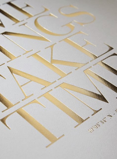
Foil stamping is the use of a malleable metallic material applied to the print surface by using heat and pressure. Foil stamping is the application of foil, a special film-backed material, to paper where a heated die is stamped onto the foil, making it adhere to the surface leaving the design of the die on the paper. Foil stamping can be combined with embossing to create a more striking 3D image.


Embossing

The creation of a raised three-dimensional design or image on paper is known as embossing. Heat and pressures reshapes the surface of the paper to create the image. Single, multi-level, beveled, and sculptured are the styles of embossing. Embossing can be done on plain paper (blind embossing) or combined with ink, images, or foil for special effects. 
Embossing is a way to add visual and tactile interest to paper. It adds texture, value, (and color if using ink or foil embossing) and perhaps other elements of design depending on the type and placement of the embossing.

The entire surface of the paper can have an embossed finish. Logos, lines, and other images may be embossed on portions of the page. Embossing is done during the printing and finished stage of a design (or during the papermaking process). Embossing machines and individual embossing stamps are also popular in paper crafting and scrapbooking. The look of embossing can also be achieved using embossing powders or inks which can be applied to paper to create a raised design.


Debossing (or Letterpress) : it's the opposite of embossing. Traditionally, the letterpress technique was used only for applying ink on a page as a form of relief printing and usually only for text. But it has evolved to also include pressing logos and other design elements directly into the paper substrate.


Thermography

Thermography uses a special powder which is added to the document with it adhering to the ink printed on the paper. After removing the excess powder the printed piece is heated and the powder and ink mixture dries to form a raised effect on the paper.


Die Cutting

Die-cutting is a process used in many different industries to cut a thin flat material (in our case, paper) into a specific shape using a steel cutting die.  It can be used to punch out a decorative shape or pattern to incorporate within a larger piece, or it can be used to create the main shape of an object by cutting the entire sheet of paper in an distinct/designed way.  More simply put: for us it’s way of making a hole in paper in a desired shape using the same presses that we use for letterpress printing.


Laser Cutting

Laser cutting is a non-contact process which utilizes a laser to cut materials, resulting in high quality, dimensionally accurate cuts. The process works by directing the laser beam through a nozzle to the workpiece. A combination of heat and pressure creates the cutting action.  The material melts, burns, vaporizes, or is blown away by a jet of gas, leaving an edge with a high-quality surface finish. 


Screen Printing
Screen printing (also known as silk screening) is one of the oldest methods of printmaking, with examples dating back to the Song Dynasty in China.  The process involves creating a stencil of an image on a screen of porous mesh, traditionally made of silk.  A roller or squeegee is used to pull paint-like ink over the stencil, forcing it through the mesh onto the paper being printed.  Unlike the inks used in some other forms of printing, screen printing ink sits right on the surface of paper, resulting in incredibly rich, vibrant color.

Wednesday, 17 December 2014

OUGD504 Brief 04 Augmented Design - Study Task 12

☞ Answer to the following questions in order to guide your criticality and creative engagement with augmented strategies :

- What is the potential of interactivity in print ? The potential of interactivity in print is to bring a new dimension in a static support. It can be interesting for viewers as the company to have a direct contact. Interactivity can have also say things that can't be shown in one single image or message. It creates a new kind of suspense, asks questions… So the message is like a staging, with a scenario, moving actors and events.

- Can augmented design help draw people to your website ? My website is a video website. I think it's important to say that is this kind of website but in my campaign, I haven't to show video extracts from the website, I find it could present non-sense pictures. The purpose is to do something funny like parodies and include the philosophy aspect of my website.

- Is it all just a bit gimmicky ? Or, are there opportunities ? What kind of interactivity would be effective for my campaign ? Thinking about including augmented design in my campaign is useful. I thought about a concept which can take account viewers in subways : there are many who travel every day and sometimes for a long time. If they see my augmented ad and use their smartphone to access my website, it can be great, because they'll take it with them and view videos for their distraction in the subway.

Sunday, 30 November 2014

OUGD504 Brief 04 Augmented Design - Study Task

Produce a 'design board' that addresses the following audience, message, tone of voice.


Review similar campaigns, creative print advertising, locations, positioning, use of colour, type, language, photogaphy, etc. to communicate tone.

There's today many creative possibilities with print support. It could be great to connect new technologies and print for my ads.

☞ The Talking Ad (Reporter without borders) : it's a simple but amazing idea. You need only a smartphone and scan the QR code to acess the video. It works for medium supports (newspapers, magazines, books).


☞ The Test-Drive Ad (Volkswagen) : here's another print ad for smartphone. It turns like a game as we saw the qualities of the car.


☞ The Bookbook (Ikea) : a funny way to present a printed book like an Iphone ad.


Another Ikea idea, the Catalogue 2014 allows you to see a furniture like IRL in a room. You just need to place the catalogue where you want it to stand and watch the results on a smartphone or tablet.


☞ Layor Creator : it's an app which make a print support alive. A photo becomes a video, we can buy a thing we saw directly on the internet, etc. It made me thinking about Harry Potter newspapers.


☞ Other printed ads which use other effects :


Wednesday, 26 November 2014

OUGD504 Brief 04 Augmented Design


This brief proposes to create print ads for the website that we created in Studio Brief 03. We need to consider how to communicate to the audience and the supports we use (cost, position, etc.).
Questions : what kind of message we want to communicate ? What language, tone of voice we'll use ? What's important to say about our website ?

Monday, 24 November 2014

OUGD504 Brief 03 A brief history of… - Study Task W3

☞ Simon proposed to us for this session to do some research to understand how the web design and new communication media work. I decided to focus on the phenomenon "Fakation."

Simon nous a proposé pour cette session de faire des recherches afin de comprendre le fonctionnement du web design et des nouveaux médias de communication. J'ai décidé de me concentrer sur le phénomène "Fakation".

✌ Definition : the word fakation comes from the contraction of fake and vacation and it refers to a viral phenomenon where people pretend to be on vacation by posting photomontages on social networks.

This trend highlights a number of questions :
- Why do people do that ?
- How much deception can go ?

Définition : le mot fakation vient de la contraction de fake (faux) et vacation (vacances) et il désigne un phénomène viral où des personnes font semblant d'être en vacances en postant des photomontages sur les réseaux sociaux.

Cette tendance met en avant plusieurs questions :
- Pourquoi les gens font-ils ça ?
- Jusqu'où la supercherie peut aller ?

The principle is very simple : take pictures and be integrated on a background of a paradise island for example, and post it on social networks. This is a parody of "real" fakation photos that our friends posting, mostly to make us jealous and envious. People have fun doing the photomontage and no matter if you are an amateur or not. Generally, a good fakation is detected by small details that shows the fraud : a poorly done trimming, apparent background or mouse cursor. There are even applications for smartphones that offers in few minutes a perfect fakation. Finally adding the hashtag #fakation on Facebook or Twitter for sharing photomontages.

Le principe est très simple : se prendre en photo et s'intégrer sur un fond d'un île paradisiaque par exemple et poster sur les réseaux sociaux. C'est une parodie des "vraies" photos de vacances que nos amis postent, la plupart du temps pour nous rendre jaloux et envieux. Les gens s'amusent à faire les photomontage et peu importe si on est amateur ou non. Généralement, un bon fakation se détecte par de petits détails qui montre l'imposture : un détourage mal fait, fond ou curseur de souris apparents. Il existe même des applications pour smartphones qui propose de faire en quelques minutes un fakation parfait. Enfin l'ajout du hashtag #fakation sur Facebook ou Twitter permet de partager les photomontages.

Fakation really poses the problem of identity and self-image on the internet. Our publications generally show the positive side of our personality and we control or erase anything that could compromise us. Social networks allow us to put ourselves on stage and sometimes act as a mask that hides the reality. That is why the fakation phenomenon is growing. However, we can ask how far this trend can go. That's what this Dutch artist wanted to test for her final project study. Zilla von den Born led to believe Facebook friends she was going for a trek in Asia for two months. The detail was very thorough : she has asked her family to participate, she did sessions tan, even watched the train schedules, created a Facebook profile for an imaginary friend... all illustrated with photo and video montages showing herself during her trip. The purpose of this experiment was to demonstrate that we should not be jealous on Facebook because most of the photos are photoshoped in some way or another. In the end, she felt alone because nobody wants to believe in her on social networks anymore.

Fakation pose vraiment le problème de l'identité et de l'image de soi sur internet. Nos publications montent généralement le côté positif de notre personnalité et nous contrôlons ou effaçons tout ce qui peut nous compromettre. Les réseaux sociaux nous permettent de nous mettre en scène et agissent parfois comme un masque qui cache la réalité. C'est pour cela que le phénomène fakation prend de l'ampleur. Cependant on peut se demander jusqu'où cette tendance peut aller. C'est ce que cette artiste hollandaise a voulu tester dans son projet de fin d'étude. Zilla von den Born a fait croire à ses amis Facebook qu'elle partait pour un un trek en Asie pendant deux mois. Le détail a été très poussé : elle a demandé à sa famille de participer, fait des séances de bronzages, regardé les horaires de train, créé un profil Facebook d'une amie imaginaire… le tout illustré par des montages photo et vidéo la montrant durant son voyage. Le but de cette expérience était de démontrer qu'il ne faut pas être jaloux sur Facebook car la plupart des photos sont trafiquée d'une manière ou d'une autre. Au final, elle s'est sentie seule car plus personne ne veut la croire dans ses faits et gestes sur les réseaux sociaux.

In conclusion, the phenomenon fakation counterbalances in a fun way the proliferation of holiday photos on social networks.

En conclusion, le phénomène fakation contrebalance d'une façon amusante la prolifération des photos de vacances sur les réseaux sociaux.

See Zilla's project - See Before report

Tuesday, 18 November 2014

OUGD504 SB03 Seminar - Search Engine Optimisation

Search Engine Optimisation (SEO) uses algorithms to access the suitability and ranking of websites based on search terms. This is a way of making alterations to websites according to the criteria that search engines use when 'crawling' web content.

What factors ?
On-the-page :
- content
- HTML
- Architecture
Off-the-page :
- links
- trust
- social
- personal
Violations :
- irrelevant/weak content
- spam
- paid for links


Video by Google about SEO :


Task : additional research on SEO

The positioning of a site is generally good-considered if it's in the top 10 search engines.

The issues:
- Make a website visible in a sustainable way
- Capture qualified traffic from search engines
- Make a brand to users

Strategy:
- Define the terms which have the best correspondence with your website :
TOO SPECIFIC terms do not generate enough traffic
TOO GENERIC terms are not sufficiently qualified
- Accurately describe the page's content : choose a title that effectively communicate the topic of the page's content.
- Create unique title tags for each page
- Use brief but descriptive titles

Another video about common mistakes in SEO :

Monday, 17 November 2014

OUGD504 SB03 Seminar - User Experience Design

User Experience Design (or UXD) is a method that shows how users interact with a product/service. It's not just the way they use it. It is also the role that the product plays in the life of a person.

Must take into account the empathy, the affects of the client. That's why brand identity exists, it creates a direct link between us and the brand. We need to believe in the company to consider a product.

Dicussion : what products or services can you think of that have significant user experience concerns ? Particularly in contrast to competing products/services.

Facebook/Twitter
Firefox/Chrome/Safari/Internet Explorer
Ebay/Amazon
YouTube/Vimeo

Design for the wild : design to where it's supposed to be.

Garrett's model of UXD : abstract to concrete, the prupose is to know what and why is the content of the product, aesthetics, etc.


Task : consider Garett's model in relation to your website :
Strategy : to present videos in a different way, explain the meaning of viral videos with a text content.
Scope : its function is based on surprise. The interaction between user and interface needs to be easy to manipulate in order to see the more of videos.
Structure : links to random videos, search bar to tap key words to find specific subjects.
Skeleton : when you are on a video page, there are links to other videos, a homepage with a selection, an about page and and a top videos page.
Sensory Design : equiity between video/text content, soft design with geometric and simple forms.

UXD Methods :
1° User research : real life user reasearch - goals of particular user groups, attitudes and behaviours
2° Personas : there are documents that describe a user type based on research


3° Content Strategy : based on user research, persona docs as well as the overall brand/project. What is the necessary content ? Hierarchy ? What content reflects brand identity ?
4° Site maps/Task flows/User journeys :


5° Wireframes :


6° A/B Testing : method of testing a variation of a system against the existing

Task : try to apply persona to your own website.
'I want to see viral videos because I'm bored.'
Key goals :
- want to be diverted
- have no precise objectives
- curious to learn new stuffs
Behaviour :
- looking for video websites
- don't want to search for a long time
- ok if someone/something choose videos in my place
Must :
- communicate in an interaction way with user to make him/her wanting to go further on the website
Not must :
- getting boring the user more than he's already

In conclusion, it's important to know precisely how the user interacts with your product/website to correspond with his needs.

Monday, 10 November 2014

OUGD504 Brief 03 A brief history of… - Development

☞ After defining the purposes of my site, I began to develop the layout of the different parts.

Après avoir défini les principes de mon site, j'ai commencé à élaborer la mise en page des différentes parties.

Homepage : the eye is animated (iris follows the cursor) / l'oeil au centre est animé (l'iris suit le curseur de la souris)

 Video Page

Video Selection

About

I wanted to make a simple template for my site because the written and video content are the most important. Adding other elements seemed inappropriate because it would disturb the video content.

Je voulais faire un thème simple pour mon site car les contenus écrit et vidéo sont le plus important. L'ajout d'autres éléments m'a semblé inapproprié car il viendrait perturber le contenu vidéo.

Junk flowchart has changed a bit and now looks like this diagram / La hiérarchie de Junk a un peu changé et ressemble à ce schéma désormais :


☞ One of studio tasks was to summarize the Web Style : logo, colors, fonts, buttons and their interaction with the cursor, grids... All important information gathered on a page.

Une des tâches du studio consistait à résumer le style de notre site : le logo, les couleurs, les polices utilisées, les boutons et leur interaction avec le curseur, grilles… Toutes les informations importantes réunies sur une page.