Brief 01 My Design Process
This was my first design fully in English. At first I was a little bit lost because I didn't know how to approach the way of working. Hopefully my classmates explained me a lot about blogging and everything I wanted to know. This short brief allowed to me to see and start my Level 05 year. At the beginning, the brainstorm session helped me define my own design process, which I never thought about before. I can notice how it was important and how many ways it can be considered. The other thing I enjoyed to try is folding paper. I tested difficult ones but I failed many times and I found that the simplest would be the clearest. Thus I created a simple form but I had to find a thing that would make the originality of my leaflet. So I tried a pop-up list. With the crit session I get the idea to take different types of paper, like tracing paper in order to create an illusion with layers. After having printed and folded my leaflet, I was really happy of the result. I was comforted with this as I gat some good feedback from my classmates. If I had to change something in my work, I would follow more the flowchart I've done at the beginning because the questions I asked was more interesting than the final list I made. I liked to see the work of the others, there were some good ideas and above all I liked to discover the English way of work which is unlike the French one.
Brief 02 Logostarter
I encountered difficulties for starting this project. I used to know and visit Kickstarter website and I think it's a really interesting way to help and finance fresh start-ups. But this time, it was hard to find a project that I'm pleased with. Moreover, the task seemed to me a little bit trouble because we had to create and define a visual identity for our chosen project but most of the projects I liked had already a good communication. So I decided to turn towards architecture projects which needed the creation of an identity. I chose the Haven House one, because I found the idea truly innovative. I stopped my research and started to find concepts for the logo. Before that, I did some research about the project and I realized that's a pretty old one but it never really worked. Then I asked myself about the reasons of this non-success and maybe it's because the communication didn't work at the past and so now. The website, the logo, they are some proofs that there were things to improve. After having analysed this, I had to find the best communication supports and I thought about the website (it was obvious) and a business card. I guess I could have done a leaflet if time had permitted me. Finally, I really like the design I've made during this short term. To conclude, this brief allowed to me to identify all problems we can encounter by planning a delivery for a client. Most of the time, there are constraints that we have to follow.
Brief 03 A brief history of…
This project introduced me how to design a website which I've never done before. I was barely anxious because I used to make design for print and coding was a huge task to approach. Hopefully when I saw I was in the same case as everybody I felt relieved. However I needed to learn more about this field. With the different tasks I've done, I see how many settings I've to take account for the elaboration of a website of a website. That reinforced me to design my own website. Thinking about a process which is different from video websites like YouTube was not easy. The purpose to viewers a choice between a random function and a selection mode. I wanted a simple template because the video and text content is enough. One of my classmates told me it looked like the Vine website because of the green and grey colours I took for this. Perhaps I had have to use another colour… but I was feeling quite proud by the ones I chose. Finally, I tried to code my website. Unfortunately I missed the workshop about that and I looked for tutos on the Internet, that was a big deal and I had not enough time to do it correctly. I preferred instead to make a little animation to explain how it works. At the end, I'm happy for having done this project. This allowed me how a website works and all the skills it involves. This made me want to continue in this way and it showed me all creative possibilities I can use and develop.
Brief 04 Augmented Design
This advertising brief has caused me some challenges but I'm happy to have been confronted with. It was not easy to make something realisable as my content was not really precise. I had only my logo and visual identity from my website and unfortunately no images except those extracted from videos. I was feeling struggled with that but finally I've found a concept: make my campaign like a game. I think people loves mysterious things so I decided to make it with an interactive tone. For the poster, I wanted a small one so people could put their smartphone on the black part and take their time to discover the website. The flyer and the stickers were made for a direct link to the network (there they get a random video like the eye concept of the homepage). On one hand I'm little bit disappointed of myself because I would have liked to do more designs for poster and flyer based on the same principle. On the other hand the hardest task for me was to familiar with the problem of cost, distribution and time-frame. I did the bast I can do for communication strategy by thinking about and like the audience. Eventually I helped myself by searching on the Internet inspiration and tips for improving that. As a conclusion, I thought it was the most difficult project I dealt with during this semester. By the way I'm aware that I didn't take enough time to make the best of it and I can feel it in designs I've done. Therefore that proves me that advertising demands a lot of process for finding the perfect concept.
Showing posts with label Brief 03. Show all posts
Showing posts with label Brief 03. Show all posts
Friday, 9 January 2015

Monday, 24 November 2014
OUGD504 Brief 03 A brief history of… - Study Task W3
☞ Simon proposed to us for this session to do some research to understand how the web design and new communication media work. I decided to focus on the phenomenon "Fakation."
Simon nous a proposé pour cette session de faire des recherches afin de comprendre le fonctionnement du web design et des nouveaux médias de communication. J'ai décidé de me concentrer sur le phénomène "Fakation".
✌ Definition : the word fakation comes from the contraction of fake and vacation and it refers to a viral phenomenon where people pretend to be on vacation by posting photomontages on social networks.
This trend highlights a number of questions :
- Why do people do that ?
- How much deception can go ?
Définition : le mot fakation vient de la contraction de fake (faux) et vacation (vacances) et il désigne un phénomène viral où des personnes font semblant d'être en vacances en postant des photomontages sur les réseaux sociaux.
Cette tendance met en avant plusieurs questions :
- Pourquoi les gens font-ils ça ?
- Jusqu'où la supercherie peut aller ?
The principle is very simple : take pictures and be integrated on a background of a paradise island for example, and post it on social networks. This is a parody of "real" fakation photos that our friends posting, mostly to make us jealous and envious. People have fun doing the photomontage and no matter if you are an amateur or not. Generally, a good fakation is detected by small details that shows the fraud : a poorly done trimming, apparent background or mouse cursor. There are even applications for smartphones that offers in few minutes a perfect fakation. Finally adding the hashtag #fakation on Facebook or Twitter for sharing photomontages.
Le principe est très simple : se prendre en photo et s'intégrer sur un fond d'un île paradisiaque par exemple et poster sur les réseaux sociaux. C'est une parodie des "vraies" photos de vacances que nos amis postent, la plupart du temps pour nous rendre jaloux et envieux. Les gens s'amusent à faire les photomontage et peu importe si on est amateur ou non. Généralement, un bon fakation se détecte par de petits détails qui montre l'imposture : un détourage mal fait, fond ou curseur de souris apparents. Il existe même des applications pour smartphones qui propose de faire en quelques minutes un fakation parfait. Enfin l'ajout du hashtag #fakation sur Facebook ou Twitter permet de partager les photomontages.
Fakation really poses the problem of identity and self-image on the internet. Our publications generally show the positive side of our personality and we control or erase anything that could compromise us. Social networks allow us to put ourselves on stage and sometimes act as a mask that hides the reality. That is why the fakation phenomenon is growing. However, we can ask how far this trend can go. That's what this Dutch artist wanted to test for her final project study. Zilla von den Born led to believe Facebook friends she was going for a trek in Asia for two months. The detail was very thorough : she has asked her family to participate, she did sessions tan, even watched the train schedules, created a Facebook profile for an imaginary friend... all illustrated with photo and video montages showing herself during her trip. The purpose of this experiment was to demonstrate that we should not be jealous on Facebook because most of the photos are photoshoped in some way or another. In the end, she felt alone because nobody wants to believe in her on social networks anymore.
Fakation pose vraiment le problème de l'identité et de l'image de soi sur internet. Nos publications montent généralement le côté positif de notre personnalité et nous contrôlons ou effaçons tout ce qui peut nous compromettre. Les réseaux sociaux nous permettent de nous mettre en scène et agissent parfois comme un masque qui cache la réalité. C'est pour cela que le phénomène fakation prend de l'ampleur. Cependant on peut se demander jusqu'où cette tendance peut aller. C'est ce que cette artiste hollandaise a voulu tester dans son projet de fin d'étude. Zilla von den Born a fait croire à ses amis Facebook qu'elle partait pour un un trek en Asie pendant deux mois. Le détail a été très poussé : elle a demandé à sa famille de participer, fait des séances de bronzages, regardé les horaires de train, créé un profil Facebook d'une amie imaginaire… le tout illustré par des montages photo et vidéo la montrant durant son voyage. Le but de cette expérience était de démontrer qu'il ne faut pas être jaloux sur Facebook car la plupart des photos sont trafiquée d'une manière ou d'une autre. Au final, elle s'est sentie seule car plus personne ne veut la croire dans ses faits et gestes sur les réseaux sociaux.
In conclusion, the phenomenon fakation counterbalances in a fun way the proliferation of holiday photos on social networks.
En conclusion, le phénomène fakation contrebalance d'une façon amusante la prolifération des photos de vacances sur les réseaux sociaux.
See Zilla's project - See Before report

Simon nous a proposé pour cette session de faire des recherches afin de comprendre le fonctionnement du web design et des nouveaux médias de communication. J'ai décidé de me concentrer sur le phénomène "Fakation".
✌ Definition : the word fakation comes from the contraction of fake and vacation and it refers to a viral phenomenon where people pretend to be on vacation by posting photomontages on social networks.
This trend highlights a number of questions :
- Why do people do that ?
- How much deception can go ?
Définition : le mot fakation vient de la contraction de fake (faux) et vacation (vacances) et il désigne un phénomène viral où des personnes font semblant d'être en vacances en postant des photomontages sur les réseaux sociaux.
Cette tendance met en avant plusieurs questions :
- Pourquoi les gens font-ils ça ?
- Jusqu'où la supercherie peut aller ?
The principle is very simple : take pictures and be integrated on a background of a paradise island for example, and post it on social networks. This is a parody of "real" fakation photos that our friends posting, mostly to make us jealous and envious. People have fun doing the photomontage and no matter if you are an amateur or not. Generally, a good fakation is detected by small details that shows the fraud : a poorly done trimming, apparent background or mouse cursor. There are even applications for smartphones that offers in few minutes a perfect fakation. Finally adding the hashtag #fakation on Facebook or Twitter for sharing photomontages.
Le principe est très simple : se prendre en photo et s'intégrer sur un fond d'un île paradisiaque par exemple et poster sur les réseaux sociaux. C'est une parodie des "vraies" photos de vacances que nos amis postent, la plupart du temps pour nous rendre jaloux et envieux. Les gens s'amusent à faire les photomontage et peu importe si on est amateur ou non. Généralement, un bon fakation se détecte par de petits détails qui montre l'imposture : un détourage mal fait, fond ou curseur de souris apparents. Il existe même des applications pour smartphones qui propose de faire en quelques minutes un fakation parfait. Enfin l'ajout du hashtag #fakation sur Facebook ou Twitter permet de partager les photomontages.
Fakation really poses the problem of identity and self-image on the internet. Our publications generally show the positive side of our personality and we control or erase anything that could compromise us. Social networks allow us to put ourselves on stage and sometimes act as a mask that hides the reality. That is why the fakation phenomenon is growing. However, we can ask how far this trend can go. That's what this Dutch artist wanted to test for her final project study. Zilla von den Born led to believe Facebook friends she was going for a trek in Asia for two months. The detail was very thorough : she has asked her family to participate, she did sessions tan, even watched the train schedules, created a Facebook profile for an imaginary friend... all illustrated with photo and video montages showing herself during her trip. The purpose of this experiment was to demonstrate that we should not be jealous on Facebook because most of the photos are photoshoped in some way or another. In the end, she felt alone because nobody wants to believe in her on social networks anymore.
Fakation pose vraiment le problème de l'identité et de l'image de soi sur internet. Nos publications montent généralement le côté positif de notre personnalité et nous contrôlons ou effaçons tout ce qui peut nous compromettre. Les réseaux sociaux nous permettent de nous mettre en scène et agissent parfois comme un masque qui cache la réalité. C'est pour cela que le phénomène fakation prend de l'ampleur. Cependant on peut se demander jusqu'où cette tendance peut aller. C'est ce que cette artiste hollandaise a voulu tester dans son projet de fin d'étude. Zilla von den Born a fait croire à ses amis Facebook qu'elle partait pour un un trek en Asie pendant deux mois. Le détail a été très poussé : elle a demandé à sa famille de participer, fait des séances de bronzages, regardé les horaires de train, créé un profil Facebook d'une amie imaginaire… le tout illustré par des montages photo et vidéo la montrant durant son voyage. Le but de cette expérience était de démontrer qu'il ne faut pas être jaloux sur Facebook car la plupart des photos sont trafiquée d'une manière ou d'une autre. Au final, elle s'est sentie seule car plus personne ne veut la croire dans ses faits et gestes sur les réseaux sociaux.
In conclusion, the phenomenon fakation counterbalances in a fun way the proliferation of holiday photos on social networks.
En conclusion, le phénomène fakation contrebalance d'une façon amusante la prolifération des photos de vacances sur les réseaux sociaux.
See Zilla's project - See Before report
Tuesday, 18 November 2014
OUGD504 SB03 Seminar - Search Engine Optimisation
Search Engine Optimisation (SEO) uses algorithms to access the suitability and ranking of websites based on search terms. This is a way of making alterations to websites according to the criteria that search engines use when 'crawling' web content.
What factors ?
On-the-page :
- content
- HTML
- Architecture
Off-the-page :
- links
- trust
- social
- personal
Violations :
- irrelevant/weak content
- spam
- paid for links

Task : additional research on SEO
The positioning of a site is generally good-considered if it's in the top 10 search engines.
The issues:
- Make a website visible in a sustainable way
- Capture qualified traffic from search engines
- Make a brand to users
Strategy:
- Define the terms which have the best correspondence with your website :
TOO SPECIFIC terms do not generate enough traffic
TOO GENERIC terms are not sufficiently qualified
- Accurately describe the page's content : choose a title that effectively communicate the topic of the page's content.
- Create unique title tags for each page
- Use brief but descriptive titles
Another video about common mistakes in SEO :
What factors ?
On-the-page :
- content
- HTML
- Architecture
Off-the-page :
- links
- trust
- social
- personal
Violations :
- irrelevant/weak content
- spam
- paid for links
Video by Google about SEO :
Task : additional research on SEO
The positioning of a site is generally good-considered if it's in the top 10 search engines.
The issues:
- Make a website visible in a sustainable way
- Capture qualified traffic from search engines
- Make a brand to users
Strategy:
- Define the terms which have the best correspondence with your website :
TOO SPECIFIC terms do not generate enough traffic
TOO GENERIC terms are not sufficiently qualified
- Accurately describe the page's content : choose a title that effectively communicate the topic of the page's content.
- Create unique title tags for each page
- Use brief but descriptive titles
Another video about common mistakes in SEO :
Monday, 10 November 2014
OUGD504 Brief 03 A brief history of… - Development
☞ After defining the purposes of my site, I began to develop the layout of the different parts.
Après avoir défini les principes de mon site, j'ai commencé à élaborer la mise en page des différentes parties.

Homepage : the eye is animated (iris follows the cursor) / l'oeil au centre est animé (l'iris suit le curseur de la souris)

Video Page

Video Selection

About
I wanted to make a simple template for my site because the written and video content are the most important. Adding other elements seemed inappropriate because it would disturb the video content.
Je voulais faire un thème simple pour mon site car les contenus écrit et vidéo sont le plus important. L'ajout d'autres éléments m'a semblé inapproprié car il viendrait perturber le contenu vidéo.
Junk flowchart has changed a bit and now looks like this diagram / La hiérarchie de Junk a un peu changé et ressemble à ce schéma désormais :

☞ One of studio tasks was to summarize the Web Style : logo, colors, fonts, buttons and their interaction with the cursor, grids... All important information gathered on a page.
Une des tâches du studio consistait à résumer le style de notre site : le logo, les couleurs, les polices utilisées, les boutons et leur interaction avec le curseur, grilles… Toutes les informations importantes réunies sur une page.


Tuesday, 4 November 2014
OUGD504 Brief 03 A brief history of… - Roughs
☞ What is the purpose of my website ?

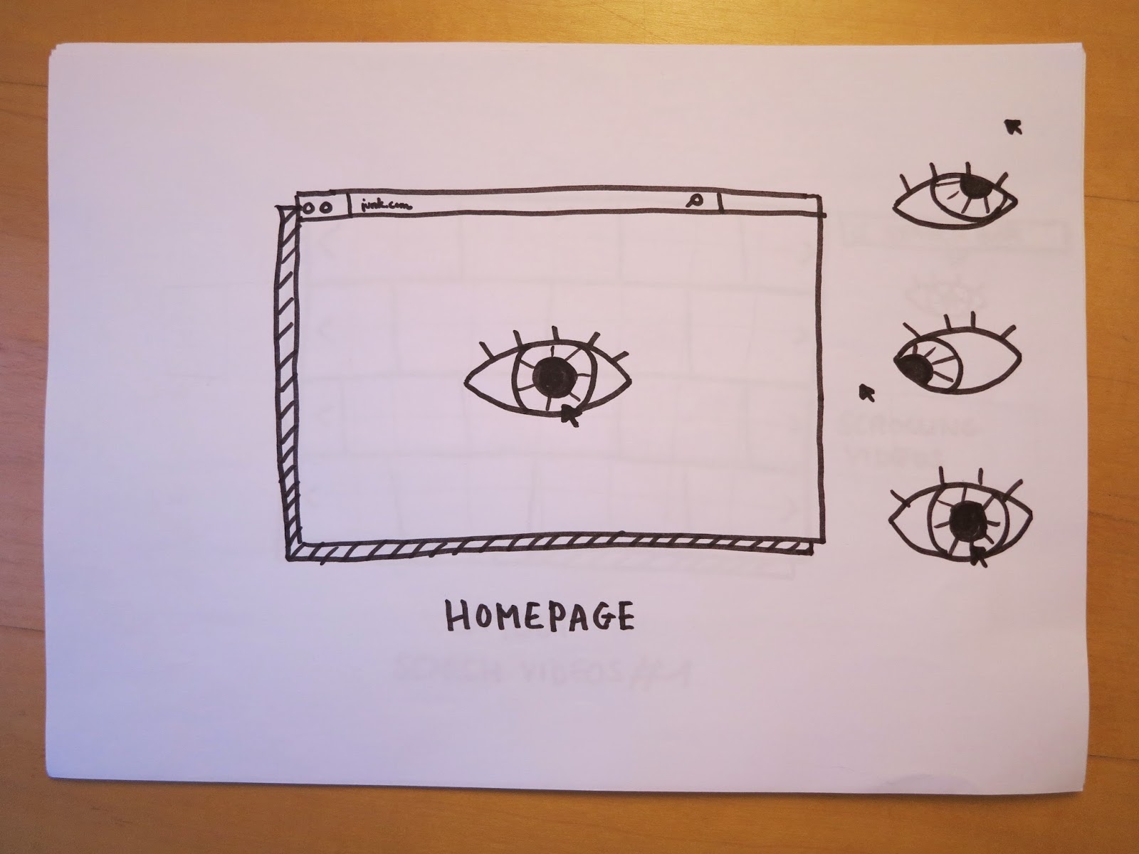
Homepage#1 : the purpose of this page is to get a video randomly and present it in a funny way. I thought about an animation of an eye that follows the mouse cursor, and when you click on that eye that lead to a random page.
Le but de cette page est d'arriver sur une vidéo de façon aléatoire et de présenter ça de manière ludique. J'en pensé à une animation d'un oeil qui suivrait le curseur de la souris, et quand on clique sur cet oeil ça mènerait sur une page au hasard.


Homepage#2 : it shows the idea #1 but more determined, the mood is asked in order to find the best video that match with it. The scrolling page shows the various proposals, like this website.
Ça reprend l'idée #1 mais en plus déterminé, on demande à l'utilisateur son humeur pour l'amener à des vidéos qui lui correspondent. La page se déroule fait apparaître les différentes propositions, à l'exemple de ce site web.


System layout for presenting a video : the layout is simple with the title, video and associated text. I have to see more structure for links to other videos (and page selection of videos).
La mise en page reste simple avec le titre, la vidéo et le texte associé. Il faut que je voie encore la structure pour les liens vers les autres vidéos (et la page de sélection de vidéos).

Video selection#1 : I didn't want to make the system list as you can see on other video sites like YouTube or Dailymotion, but it is difficult to present a large number of videos without falling into a screen printing too "busy". The idea of the following proposition is to cut the page into 4 parts and you can scroll each band. This system can be applied to tablet format.
Je ne voulais pas reprendre le système de liste qu'on peut voir sur les autres sites de vidéo comme YouTube ou Dailymotion mais il est compliqué de présenter un nombre important de vidéos sans tomber dans une impression d'écran trop "occupé". L'idée de la proposition suivante est de couper la page en 4 et de pouvoir faire glisser chaque bande. Ce système peut être intéressant appliqué au format tablette.
Other systems with the same idea :


☞ Logo think : I looked for a name for my site, I was thinking about a word like "Cataract" an eye disease because viral videos can hurt the eye by stupid content. But finally I opted for "Junk" like junk food, junk mail, etc. and this fits to the concept pretty well. The baseline can be for example : "eating wtf videos" in order to explain the purpose of the site.
J'ai cherché un nom pour mon site, j'ai pensé à un mot comme "cataracte" (une maladie de l'œil parce que les vidéos virales peuvent heurter l'œil par le contenu stupide). Mais finalement j'ai opté pour "Junk" comme junk food, junk mail, etc. Cela correspond plutôt bien au concept. La baseline peut être par exemple: "eating wtf videos" afin d'expliquer le but du site.

- Watching viral videos in a different way
- A text content explains why this kind of videos exists, how to think about it
- The text content will be a philosophy presentation of the videos but in an offbeat humorous tone
- Target audience : young audience (around 18-25 years) who are interested in pop culture, new media technologies, etc.
Quel est le but de mon site?
- Regarder des vidéos virales d'une manière différente
- Un texte explique pourquoi ce genre de vidéos existe, que penser d'elles
- Le texte présentera les vidéos de manière à la fois philosophique et humoristique
- Cible : jeune public (environ 18-25 ans) qui sont intéressés par la culture pop, les nouvelles technologies de communication, etc.
- A text content explains why this kind of videos exists, how to think about it
- The text content will be a philosophy presentation of the videos but in an offbeat humorous tone
- Target audience : young audience (around 18-25 years) who are interested in pop culture, new media technologies, etc.
Quel est le but de mon site?
- Regarder des vidéos virales d'une manière différente
- Un texte explique pourquoi ce genre de vidéos existe, que penser d'elles
- Le texte présentera les vidéos de manière à la fois philosophique et humoristique
- Cible : jeune public (environ 18-25 ans) qui sont intéressés par la culture pop, les nouvelles technologies de communication, etc.
Flowchart :
Then I thought about possible layout for the site / J'ai ensuite réfléchi à des mise en pages possibles pour le site :
Homepage#1 : the purpose of this page is to get a video randomly and present it in a funny way. I thought about an animation of an eye that follows the mouse cursor, and when you click on that eye that lead to a random page.
Le but de cette page est d'arriver sur une vidéo de façon aléatoire et de présenter ça de manière ludique. J'en pensé à une animation d'un oeil qui suivrait le curseur de la souris, et quand on clique sur cet oeil ça mènerait sur une page au hasard.
Ça reprend l'idée #1 mais en plus déterminé, on demande à l'utilisateur son humeur pour l'amener à des vidéos qui lui correspondent. La page se déroule fait apparaître les différentes propositions, à l'exemple de ce site web.
System layout for presenting a video : the layout is simple with the title, video and associated text. I have to see more structure for links to other videos (and page selection of videos).
La mise en page reste simple avec le titre, la vidéo et le texte associé. Il faut que je voie encore la structure pour les liens vers les autres vidéos (et la page de sélection de vidéos).
Video selection#1 : I didn't want to make the system list as you can see on other video sites like YouTube or Dailymotion, but it is difficult to present a large number of videos without falling into a screen printing too "busy". The idea of the following proposition is to cut the page into 4 parts and you can scroll each band. This system can be applied to tablet format.
Je ne voulais pas reprendre le système de liste qu'on peut voir sur les autres sites de vidéo comme YouTube ou Dailymotion mais il est compliqué de présenter un nombre important de vidéos sans tomber dans une impression d'écran trop "occupé". L'idée de la proposition suivante est de couper la page en 4 et de pouvoir faire glisser chaque bande. Ce système peut être intéressant appliqué au format tablette.
Other systems with the same idea :
☞ Logo think : I looked for a name for my site, I was thinking about a word like "Cataract" an eye disease because viral videos can hurt the eye by stupid content. But finally I opted for "Junk" like junk food, junk mail, etc. and this fits to the concept pretty well. The baseline can be for example : "eating wtf videos" in order to explain the purpose of the site.
J'ai cherché un nom pour mon site, j'ai pensé à un mot comme "cataracte" (une maladie de l'œil parce que les vidéos virales peuvent heurter l'œil par le contenu stupide). Mais finalement j'ai opté pour "Junk" comme junk food, junk mail, etc. Cela correspond plutôt bien au concept. La baseline peut être par exemple: "eating wtf videos" afin d'expliquer le but du site.
Wednesday, 29 October 2014
OUGD504 Brief 03 A brief history of… - Introduction to Design for Web
☞ On the 6th August 1991, the CERN, the European nuclear research laboratory, authorized the use of the World Wide Web protocol on which is based on the majority content on the Internet. We can find below the first web page.
Le 6 août 1991, le Cern, le laboratoire européen de recherches nucléaires, autorisait l'utilisation du protocole World Wide Web sur lequel est basé la majeure partie des contenus créés sur internet. En dessous se trouve la première page web.


- Who is the target audience ?
- Why this website needs to exist ?
Avant d'élaborer un site internet, voici à quoi on doit réfléchir :
Le 6 août 1991, le Cern, le laboratoire européen de recherches nucléaires, autorisait l'utilisation du protocole World Wide Web sur lequel est basé la majeure partie des contenus créés sur internet. En dessous se trouve la première page web.
The first published photo represents a girl false band, the Cernettes :
Pour la première photo mise en ligne sur le web, le Cern a créé un faux girl band, les Cernettes :
☞ Terminology :
- HTML (Hypertext Markup Language) : the standard language used in the creation of web pages
- HTTP (Hypertext Transfer Protocol) : the basis for the transfer of data across the World Wide Web
- URL (Uniform Ressource Locator) : also known as a web address and used to refer web pages
- CSS (Cascading Style Sheet) : a style sheet mark up language used for formatting
Il existe plusieurs formats de données :
- HTML (Hypertext Markup Language) : le langage standard utilisé dans la création de pages web
- HTTP (Hypertext Transfer Protocol) : la base pour le transfert de données sur le World Wide Web
- URL (Uniform Ressource Locator) : également connu sous le nom d'une adresse internet et utilisé pour référencer les pages web
- CSS (Cascading Style Sheet) : une feuille de style utilisé pour le formatage
☞ Before starting to design a website, here's what we have to think about :
- What is the purpose of this website?- Who is the target audience ?
- Why this website needs to exist ?
Avant d'élaborer un site internet, voici à quoi on doit réfléchir :
- Quel est le but du site ?
- À qui il est destiné ?
- Pourquoi ce site doit exister ?
☞ Considerations to design :
- Size : there are other sizes to take into account, they're different compared with print supports and it's necessary to work with all screens
- Colours : they're not the same as print, we can use the RGB pallet but it needs to stay "safe"
- Fonts : we have to use common web fonts (like Arial, Times) because it replaced if our "fantasy fonts" are not installed in the users computer
- Size : there are other sizes to take into account, they're different compared with print supports and it's necessary to work with all screens
- Colours : they're not the same as print, we can use the RGB pallet but it needs to stay "safe"
- Fonts : we have to use common web fonts (like Arial, Times) because it replaced if our "fantasy fonts" are not installed in the users computer
Paramètres pour la conception :
- Taille : il y a d'autres tailles à prendre en compte, elles sont différentes de celles des supports imprimés et elles doivent s'adapter pour les écrans des utilisateurs
- Couleurs : le choix des couleurs se limite à la palette RVB et leur cobinaison doit rester harmonieuse
- Typographies : on doit choisir des typographies communes (ex : Arial, Times) car elles peuvent être remplacées si elles ne sont pas installées sur l'ordinateur des utilisateurs
☞ Trends
- The decline of skeuomorphism (a derivative object that retains ornamental design cues from structures that were necessary in the original)
- The rise of flat design
- Single page website (ex : Cyclemon)
- Responsive design
- Type based websites
Tendances :
- Le déclin du skeuomorphism (un objet dérivé qui réutilise les propriétés du modèle original)
- L'essor du flat design
- Les sites web en une page
- Responsive Design
- Sites basés sur la typographie

☞ Trends
- The decline of skeuomorphism (a derivative object that retains ornamental design cues from structures that were necessary in the original)
- The rise of flat design
- Single page website (ex : Cyclemon)
- Responsive design
- Type based websites
Tendances :
- Le déclin du skeuomorphism (un objet dérivé qui réutilise les propriétés du modèle original)
- L'essor du flat design
- Les sites web en une page
- Responsive Design
- Sites basés sur la typographie
Example of skeuomorphism : the digital shelf
As a conclusion, a website needs to be effective to catch the audience in the first few second after its opening.
En conclusion, un site doit être efficace pour attirer l'attention du public en quelques secondes après son ouverture.
Tuesday, 21 October 2014
OUGD404 Brief 03 A brief history of… - Website + Crit
☞ Presentation
As I have not been able to work on the Summer Brief, I tried to find a new concept of website. My idea is this : create a site that presents and analyzes several viral videos every week. The goal is to bring a humorous and offbeat decryption of the videos. The concept must go beyond the traditional video sites like YouTube and Dailymotion. Viral videos will be selected by the authors and sorted by topic and presented in a different way than the "list" type. The analyzes provide a philosophical reflection on the human condition, they help us build our own critical and step back on objective videos.
Présentation
Comme je n'ai pas pu travailler sur le Summer Brief, j'ai essayé de trouver un concept de site internet. Mon idée est la suivante : créer un site qui présente et analyse chaque semaine plusieurs vidéos virales. Le but est d'apporter un décryptage humoristique et décalé sur des vidéos qui font le buzz. Le concept doit aller plus loin que les sites de vidéos en ligne traditionnels comme YouTube et Dailymotion. Les vidéos virales seront sélectionnées par les auteurs et triées par thèmes et présentées d'une autre façon que le type "liste". Les analyses apporteront une réflexion philosophique sur la condition humaine, elles nous aident à construire un avis critique et prendre du recul sur l'objectivité des vidéos.
☞ How I see my website
I want it to be as interactive as possible without becoming complex in its navigation. Different themes could be featured on the home page in a cloud of hashtags or suggestive logos, each guiding the visitor to the videos.
Comment je vois mon site
Je voudrais qu'il soit le plus interactif que possible sans qu'il devienne complexe dans sa navigation. Les différents thèmes pourraient être présentés sur la page d'accueil dans un nuage de hashtags ou de logos suggestifs, chacun guidant le visiteur vers les vidéos.
☞ Crits
- Think about how to present videos
- Find an original grid on which to base for my site
- Reflect on the content of my website (articles)
Critiques
- Penser à la manière de présenter les vidéos
- Trouver une grille originale sur laquelle me baser pour mon site
- Réfléchir sur le contenu de mon site (articles)
As I have not been able to work on the Summer Brief, I tried to find a new concept of website. My idea is this : create a site that presents and analyzes several viral videos every week. The goal is to bring a humorous and offbeat decryption of the videos. The concept must go beyond the traditional video sites like YouTube and Dailymotion. Viral videos will be selected by the authors and sorted by topic and presented in a different way than the "list" type. The analyzes provide a philosophical reflection on the human condition, they help us build our own critical and step back on objective videos.
Présentation
Comme je n'ai pas pu travailler sur le Summer Brief, j'ai essayé de trouver un concept de site internet. Mon idée est la suivante : créer un site qui présente et analyse chaque semaine plusieurs vidéos virales. Le but est d'apporter un décryptage humoristique et décalé sur des vidéos qui font le buzz. Le concept doit aller plus loin que les sites de vidéos en ligne traditionnels comme YouTube et Dailymotion. Les vidéos virales seront sélectionnées par les auteurs et triées par thèmes et présentées d'une autre façon que le type "liste". Les analyses apporteront une réflexion philosophique sur la condition humaine, elles nous aident à construire un avis critique et prendre du recul sur l'objectivité des vidéos.
☞ How I see my website
I want it to be as interactive as possible without becoming complex in its navigation. Different themes could be featured on the home page in a cloud of hashtags or suggestive logos, each guiding the visitor to the videos.
Comment je vois mon site
Je voudrais qu'il soit le plus interactif que possible sans qu'il devienne complexe dans sa navigation. Les différents thèmes pourraient être présentés sur la page d'accueil dans un nuage de hashtags ou de logos suggestifs, chacun guidant le visiteur vers les vidéos.
☞ Crits
- Think about how to present videos
- Find an original grid on which to base for my site
- Reflect on the content of my website (articles)
Critiques
- Penser à la manière de présenter les vidéos
- Trouver une grille originale sur laquelle me baser pour mon site
- Réfléchir sur le contenu de mon site (articles)
Sunday, 19 October 2014


Subscribe to:
Posts (Atom)