Friday, 9 January 2015

OUGD504 Module Evaluation Semester 1

This semester have been a great discovery for me. I tried to adapt myself the most as possible into the way of working. at first I was amazed by one-week briefs because I was not used by these delays. However I enjoyed that and I was surprised myself by my capability to work quickly. I also liked the crits groups. It's really interesting to see and discuss about the others' work.

Among the four briefs I've done though this semester, I preferred "A brief history of…" one. I was not sure to find a good concept in so far as I didn't make the Summer Brief. Finally I thought I would be challenging to design a video content website. It was a real opportunity to achieve this kind of work as I was used to do only printed ones. The thing I enjoyed the most was testing my skills on AfterEffects. Indeed I learned the basis of this software a long time ago and I wanted to make the animation of my website. I was impressed by the result and happy to have done it, I could not coding because I have very little knowledge about this field.

Then I enjoyed workshops which helped me in different tasks during all this semester. To conclude this semester brings me a very impression and I learned more about myself, my way to work. The briefs I accomplished allowed me to improve my skills in software and opened me many opportunities in different fields of graphic design.

Evaluations Semester 1

Brief 01 My Design Process

This was my first design fully in English. At first I was a little bit lost because I didn't know how to approach the way of working. Hopefully my classmates explained me a lot about blogging and everything I wanted to know. This short brief allowed to me to see and start my Level 05 year. At the beginning, the brainstorm session helped me define my own design process, which I never thought about before. I can notice how it was important and how many ways it can be considered. The other thing I enjoyed to try is folding paper. I tested difficult ones but I failed many times and I found that the simplest would be the clearest. Thus I created a simple form but I had to find a thing that would make the originality of my leaflet. So I tried a pop-up list. With the crit session I get the idea to take different types of paper, like tracing paper in order to create an illusion with layers. After having printed and folded my leaflet, I was really happy of the result. I was comforted with this as I gat some good feedback from my classmates. If I had to change something in my work, I would follow more the flowchart I've done at the beginning because the questions I asked was more interesting than the final list I made. I liked to see the work of the others, there were some good ideas and above all I liked to discover the English way of work which is unlike the French one.


Brief 02 Logostarter

I encountered difficulties for starting this project. I used to know and visit Kickstarter website and I think it's a really interesting way to help and finance fresh start-ups. But this time, it was hard to find a project that I'm pleased with. Moreover, the task seemed to me a little bit trouble because we had to create and define a visual identity for our chosen project but most of the projects I liked had already a good communication. So I decided to turn towards architecture projects which needed the creation of an identity. I chose the Haven House one, because I found the idea truly innovative. I stopped my research and started to find concepts for the logo. Before that, I did some research about the project and I realized that's a pretty old one but it never really worked. Then I asked myself about the reasons of this non-success and maybe it's because the communication didn't work at the past and so now. The website, the logo, they are some proofs that there were things to improve. After having analysed this, I had to find the best communication supports and I thought about the website (it was obvious) and a business card. I guess I could have done a leaflet if time had permitted me. Finally, I really like the design I've made during this short term. To conclude, this brief allowed to me to identify all problems we can encounter by planning a delivery for a client. Most of the time, there are constraints that we have to follow.

Brief 03 A brief history of…

This project introduced me how to design a website which I've never done before. I was barely anxious because I used to make design for print and coding was a huge task to approach. Hopefully when I saw I was in the same case as everybody I felt relieved. However I needed to learn more about this field. With the different tasks I've done, I see how many settings I've to take account for the elaboration of a website of a website. That reinforced me to design my own website. Thinking about a process which is different from video websites like YouTube was not easy. The purpose to viewers a choice between a random function and a selection mode. I wanted a simple template because the video and text content is enough. One of my classmates told me it looked like the Vine website because of the green and grey colours I took for this. Perhaps I had have to use another colour… but I was feeling quite proud by the ones I chose. Finally, I tried to code my website. Unfortunately I missed the workshop about that and I looked for tutos on the Internet, that was a big deal and I had not enough time to do it correctly. I preferred instead to make a little animation to explain how it works. At the end, I'm happy for having done this project. This allowed me how a website works and all the skills it involves. This made me want to continue in this way and it showed me all creative possibilities I can use and develop.

Brief 04 Augmented Design

This advertising brief has caused me some challenges but I'm happy to have been confronted with. It was not easy to make something realisable as my content was not really precise. I had only my logo and visual identity from my website and unfortunately no images except those extracted from videos. I was feeling struggled with that but finally I've found a concept: make my campaign like a game. I think people loves mysterious things so I decided to make it with an interactive tone. For the poster, I wanted a small one so people could put their smartphone on the black part and take their time to discover the website. The flyer and the stickers were made for a direct link to the network (there they get a random video like the eye concept of the homepage). On one hand I'm little bit disappointed of myself because I would have liked to do more designs for poster and flyer based on the same principle. On the other hand the hardest task for me was to familiar with the problem of cost, distribution and time-frame. I did the bast I can do for communication strategy by thinking about and like the audience. Eventually I helped myself by searching on the Internet inspiration and tips for improving that. As a conclusion, I thought it was the most difficult project I dealt with during this semester. By the way I'm aware that I didn't take enough time to make the best of it and I can feel it in designs I've done. Therefore that proves me that advertising demands a lot of process for finding the perfect concept.

Tuesday, 6 January 2015

OUGD504 Brief 04 Augmented Design - Study Task 11

☞ Project Rationale

- Purpose/reason of the campaign : The reason of my website campaign is to let know people that it exists and let draw them to watch the videos.

- Audience/Message/Tone of voice :


Format : printed advertising campaign (bildboards, magazines, newspapers…) with augmented design dimension.

Materials & Budget : Paper, Digital supports : my objective for this brief is to make 3 supports : a little poster, a flyer and a sticker which would be dispatched.

Flyer

Poster

Stickers

Total price is about £200 for the whole communication.

Placement/distribution : I still believe that public areas placement would be great : streets, restaurants, subways, etc. I have to target my audience but there's a possibility that other people could be interrogated and interested by the concept.

Must do's : be funny ; attract viewer's curiosity

Must not's : use video extract ; be too explicit

Time-frame : as the purpose is to reveal the existence of my website for launching it, I think there's no need to make my campaign last. The ideal time-frame in my view would be 2 months. This is enough for being seen by the audience which tends to zap information quickly.

Thursday, 18 December 2014

OUGD504 Brief 04 Augmented Design - Study Task 13

Print Finishes

There are many creative possibilities for print :

Varnishes


A varnish is a liquid shellac or plastic-like put on a printed piece like a layer or clear ink, varnish adds a glossy, satin or matte finish. Part of the printing or finishing process, varnish is applied like a final layer of ink after a piece is printed. It may be clear or tinted.
Glossy finish

Matte finish

Spot varnish
This is a special effect that puts an overprint varnish only on specific areas of a printed piece, spot varnish is often used to make a photograph pop off the page, highlights drop caps, or to create texture and subtle images on the page. The term spot varnish can refer to more than just clear ink or resin varnish but also to the spot application or Ultra-violet (UV) coatings or Aqueous (AQ) finishes.


Lamination
This is one of the more expensive but more accurate types of prepress proofs are laminate proofs. These full-color proofs are created from the negatives used to make the printing plates. Each separation is transferred to a separate sheet and the layers are fused or laminated together to give an extremely accurate representation of the final printed piece.

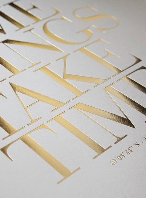
Foil Stamping

Foil stamping is the use of a malleable metallic material applied to the print surface by using heat and pressure. Foil stamping is the application of foil, a special film-backed material, to paper where a heated die is stamped onto the foil, making it adhere to the surface leaving the design of the die on the paper. Foil stamping can be combined with embossing to create a more striking 3D image.


Embossing

The creation of a raised three-dimensional design or image on paper is known as embossing. Heat and pressures reshapes the surface of the paper to create the image. Single, multi-level, beveled, and sculptured are the styles of embossing. Embossing can be done on plain paper (blind embossing) or combined with ink, images, or foil for special effects. 
Embossing is a way to add visual and tactile interest to paper. It adds texture, value, (and color if using ink or foil embossing) and perhaps other elements of design depending on the type and placement of the embossing.

The entire surface of the paper can have an embossed finish. Logos, lines, and other images may be embossed on portions of the page. Embossing is done during the printing and finished stage of a design (or during the papermaking process). Embossing machines and individual embossing stamps are also popular in paper crafting and scrapbooking. The look of embossing can also be achieved using embossing powders or inks which can be applied to paper to create a raised design.


Debossing (or Letterpress) : it's the opposite of embossing. Traditionally, the letterpress technique was used only for applying ink on a page as a form of relief printing and usually only for text. But it has evolved to also include pressing logos and other design elements directly into the paper substrate.


Thermography

Thermography uses a special powder which is added to the document with it adhering to the ink printed on the paper. After removing the excess powder the printed piece is heated and the powder and ink mixture dries to form a raised effect on the paper.


Die Cutting

Die-cutting is a process used in many different industries to cut a thin flat material (in our case, paper) into a specific shape using a steel cutting die.  It can be used to punch out a decorative shape or pattern to incorporate within a larger piece, or it can be used to create the main shape of an object by cutting the entire sheet of paper in an distinct/designed way.  More simply put: for us it’s way of making a hole in paper in a desired shape using the same presses that we use for letterpress printing.


Laser Cutting

Laser cutting is a non-contact process which utilizes a laser to cut materials, resulting in high quality, dimensionally accurate cuts. The process works by directing the laser beam through a nozzle to the workpiece. A combination of heat and pressure creates the cutting action.  The material melts, burns, vaporizes, or is blown away by a jet of gas, leaving an edge with a high-quality surface finish. 


Screen Printing
Screen printing (also known as silk screening) is one of the oldest methods of printmaking, with examples dating back to the Song Dynasty in China.  The process involves creating a stencil of an image on a screen of porous mesh, traditionally made of silk.  A roller or squeegee is used to pull paint-like ink over the stencil, forcing it through the mesh onto the paper being printed.  Unlike the inks used in some other forms of printing, screen printing ink sits right on the surface of paper, resulting in incredibly rich, vibrant color.

Wednesday, 17 December 2014

OUGD504 Brief 04 Augmented Design - Study Task 12

☞ Answer to the following questions in order to guide your criticality and creative engagement with augmented strategies :

- What is the potential of interactivity in print ? The potential of interactivity in print is to bring a new dimension in a static support. It can be interesting for viewers as the company to have a direct contact. Interactivity can have also say things that can't be shown in one single image or message. It creates a new kind of suspense, asks questions… So the message is like a staging, with a scenario, moving actors and events.

- Can augmented design help draw people to your website ? My website is a video website. I think it's important to say that is this kind of website but in my campaign, I haven't to show video extracts from the website, I find it could present non-sense pictures. The purpose is to do something funny like parodies and include the philosophy aspect of my website.

- Is it all just a bit gimmicky ? Or, are there opportunities ? What kind of interactivity would be effective for my campaign ? Thinking about including augmented design in my campaign is useful. I thought about a concept which can take account viewers in subways : there are many who travel every day and sometimes for a long time. If they see my augmented ad and use their smartphone to access my website, it can be great, because they'll take it with them and view videos for their distraction in the subway.

Monday, 15 December 2014

Digital Print Workshop - Working with colours for commercial print

☞ For this workshop, we focused on Photoshop colour layouts.

Proof colors : The normal color mode for commercial prints is CMYK, but the default color mode on Photoshop is RGB, you can work in this mode but see the result in CYMK by choosing this color mode in Image>Mode>CYMK Color :


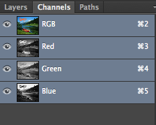
Then you can see the 2 color modes are shown on the tab :


You can preview the CMYK colours by selecting View>Proof Colors (⌘Y)

Gamut warning : by activating this tool, you have a look on areas which can't be printed (so they are indicated by the gray color areas).


In order to decrease the grey areas, you need to modify the adjustments like the levels, the saturation for example. You can use also the magic wand to select affected areas and change only adjustments on these parts.


Swatches : it's the same thing as swatches on Illustrator. You reset the pallet colour and create a new one by selecting colours on the image. Then you can save your pallet and reuse for finding it again or for another project.


Spot colours/Duotones/Channels : sometimes it's cheaper to use spot colour inks than the whole CMYK inks. You can access in the Pantone library in the colour picker pallet. In the duotone option, you can choose the number of spot colour and their intensity thanks to the curve. 


Channel colours separate the different layers of the image. Choose the Gray mode and create a New Spot Channel. Then you can apply a spot colour in the image thanks to the black brush or erase this colors with the white brush.