Wednesday, 17 December 2014

OUGD504 Brief 04 Augmented Design - Study Task 12

☞ Answer to the following questions in order to guide your criticality and creative engagement with augmented strategies :

- What is the potential of interactivity in print ? The potential of interactivity in print is to bring a new dimension in a static support. It can be interesting for viewers as the company to have a direct contact. Interactivity can have also say things that can't be shown in one single image or message. It creates a new kind of suspense, asks questions… So the message is like a staging, with a scenario, moving actors and events.

- Can augmented design help draw people to your website ? My website is a video website. I think it's important to say that is this kind of website but in my campaign, I haven't to show video extracts from the website, I find it could present non-sense pictures. The purpose is to do something funny like parodies and include the philosophy aspect of my website.

- Is it all just a bit gimmicky ? Or, are there opportunities ? What kind of interactivity would be effective for my campaign ? Thinking about including augmented design in my campaign is useful. I thought about a concept which can take account viewers in subways : there are many who travel every day and sometimes for a long time. If they see my augmented ad and use their smartphone to access my website, it can be great, because they'll take it with them and view videos for their distraction in the subway.

Monday, 15 December 2014

Digital Print Workshop - Working with colours for commercial print

☞ For this workshop, we focused on Photoshop colour layouts.

Proof colors : The normal color mode for commercial prints is CMYK, but the default color mode on Photoshop is RGB, you can work in this mode but see the result in CYMK by choosing this color mode in Image>Mode>CYMK Color :


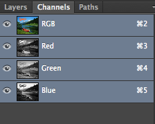
Then you can see the 2 color modes are shown on the tab :


You can preview the CMYK colours by selecting View>Proof Colors (⌘Y)

Gamut warning : by activating this tool, you have a look on areas which can't be printed (so they are indicated by the gray color areas).


In order to decrease the grey areas, you need to modify the adjustments like the levels, the saturation for example. You can use also the magic wand to select affected areas and change only adjustments on these parts.


Swatches : it's the same thing as swatches on Illustrator. You reset the pallet colour and create a new one by selecting colours on the image. Then you can save your pallet and reuse for finding it again or for another project.


Spot colours/Duotones/Channels : sometimes it's cheaper to use spot colour inks than the whole CMYK inks. You can access in the Pantone library in the colour picker pallet. In the duotone option, you can choose the number of spot colour and their intensity thanks to the curve. 


Channel colours separate the different layers of the image. Choose the Gray mode and create a New Spot Channel. Then you can apply a spot colour in the image thanks to the black brush or erase this colors with the white brush.


Sunday, 30 November 2014

OUGD504 Brief 04 Augmented Design - Study Task

Produce a 'design board' that addresses the following audience, message, tone of voice.


Review similar campaigns, creative print advertising, locations, positioning, use of colour, type, language, photogaphy, etc. to communicate tone.

There's today many creative possibilities with print support. It could be great to connect new technologies and print for my ads.

☞ The Talking Ad (Reporter without borders) : it's a simple but amazing idea. You need only a smartphone and scan the QR code to acess the video. It works for medium supports (newspapers, magazines, books).


☞ The Test-Drive Ad (Volkswagen) : here's another print ad for smartphone. It turns like a game as we saw the qualities of the car.


☞ The Bookbook (Ikea) : a funny way to present a printed book like an Iphone ad.


Another Ikea idea, the Catalogue 2014 allows you to see a furniture like IRL in a room. You just need to place the catalogue where you want it to stand and watch the results on a smartphone or tablet.


☞ Layor Creator : it's an app which make a print support alive. A photo becomes a video, we can buy a thing we saw directly on the internet, etc. It made me thinking about Harry Potter newspapers.


☞ Other printed ads which use other effects :


Saturday, 29 November 2014

OUGD503 Responsive Brief 01 Individual Practice - Feathr Submission

☞ I designed a wallpaper for the contest. I wanted to do some illustration for that in order to express myself. The peculiarity of my wallpaper is the 'false' repetition. We have the impression that the face is the same, but when we look twice, eye position changes. I called it 'Jean-Pierre', a french-fashioned name because of the style of my character and I want people to feel a direct connection with the wallpaper as Tom said : "it needs to say something". You can see my design on Feathr website.


My repetition


Maybe we can have a uncomfortable sensation that the character is following us but that's the point and I am content that I created this design. It's like to have the 'Joconde' at home, that has inspired me.

Wednesday, 26 November 2014

OUGD504 Brief 04 Augmented Design


This brief proposes to create print ads for the website that we created in Studio Brief 03. We need to consider how to communicate to the audience and the supports we use (cost, position, etc.).
Questions : what kind of message we want to communicate ? What language, tone of voice we'll use ? What's important to say about our website ?

Monday, 24 November 2014

OUGD504 Brief 03 A brief history of… - Study Task W3

☞ Simon proposed to us for this session to do some research to understand how the web design and new communication media work. I decided to focus on the phenomenon "Fakation."

Simon nous a proposé pour cette session de faire des recherches afin de comprendre le fonctionnement du web design et des nouveaux médias de communication. J'ai décidé de me concentrer sur le phénomène "Fakation".

✌ Definition : the word fakation comes from the contraction of fake and vacation and it refers to a viral phenomenon where people pretend to be on vacation by posting photomontages on social networks.

This trend highlights a number of questions :
- Why do people do that ?
- How much deception can go ?

Définition : le mot fakation vient de la contraction de fake (faux) et vacation (vacances) et il désigne un phénomène viral où des personnes font semblant d'être en vacances en postant des photomontages sur les réseaux sociaux.

Cette tendance met en avant plusieurs questions :
- Pourquoi les gens font-ils ça ?
- Jusqu'où la supercherie peut aller ?

The principle is very simple : take pictures and be integrated on a background of a paradise island for example, and post it on social networks. This is a parody of "real" fakation photos that our friends posting, mostly to make us jealous and envious. People have fun doing the photomontage and no matter if you are an amateur or not. Generally, a good fakation is detected by small details that shows the fraud : a poorly done trimming, apparent background or mouse cursor. There are even applications for smartphones that offers in few minutes a perfect fakation. Finally adding the hashtag #fakation on Facebook or Twitter for sharing photomontages.

Le principe est très simple : se prendre en photo et s'intégrer sur un fond d'un île paradisiaque par exemple et poster sur les réseaux sociaux. C'est une parodie des "vraies" photos de vacances que nos amis postent, la plupart du temps pour nous rendre jaloux et envieux. Les gens s'amusent à faire les photomontage et peu importe si on est amateur ou non. Généralement, un bon fakation se détecte par de petits détails qui montre l'imposture : un détourage mal fait, fond ou curseur de souris apparents. Il existe même des applications pour smartphones qui propose de faire en quelques minutes un fakation parfait. Enfin l'ajout du hashtag #fakation sur Facebook ou Twitter permet de partager les photomontages.

Fakation really poses the problem of identity and self-image on the internet. Our publications generally show the positive side of our personality and we control or erase anything that could compromise us. Social networks allow us to put ourselves on stage and sometimes act as a mask that hides the reality. That is why the fakation phenomenon is growing. However, we can ask how far this trend can go. That's what this Dutch artist wanted to test for her final project study. Zilla von den Born led to believe Facebook friends she was going for a trek in Asia for two months. The detail was very thorough : she has asked her family to participate, she did sessions tan, even watched the train schedules, created a Facebook profile for an imaginary friend... all illustrated with photo and video montages showing herself during her trip. The purpose of this experiment was to demonstrate that we should not be jealous on Facebook because most of the photos are photoshoped in some way or another. In the end, she felt alone because nobody wants to believe in her on social networks anymore.

Fakation pose vraiment le problème de l'identité et de l'image de soi sur internet. Nos publications montent généralement le côté positif de notre personnalité et nous contrôlons ou effaçons tout ce qui peut nous compromettre. Les réseaux sociaux nous permettent de nous mettre en scène et agissent parfois comme un masque qui cache la réalité. C'est pour cela que le phénomène fakation prend de l'ampleur. Cependant on peut se demander jusqu'où cette tendance peut aller. C'est ce que cette artiste hollandaise a voulu tester dans son projet de fin d'étude. Zilla von den Born a fait croire à ses amis Facebook qu'elle partait pour un un trek en Asie pendant deux mois. Le détail a été très poussé : elle a demandé à sa famille de participer, fait des séances de bronzages, regardé les horaires de train, créé un profil Facebook d'une amie imaginaire… le tout illustré par des montages photo et vidéo la montrant durant son voyage. Le but de cette expérience était de démontrer qu'il ne faut pas être jaloux sur Facebook car la plupart des photos sont trafiquée d'une manière ou d'une autre. Au final, elle s'est sentie seule car plus personne ne veut la croire dans ses faits et gestes sur les réseaux sociaux.

In conclusion, the phenomenon fakation counterbalances in a fun way the proliferation of holiday photos on social networks.

En conclusion, le phénomène fakation contrebalance d'une façon amusante la prolifération des photos de vacances sur les réseaux sociaux.

See Zilla's project - See Before report

Friday, 21 November 2014

Digital Print Workshop

We've got a workshop about how to mange colours in commercial printed.

There're 3 way on commercial print : Offset Lithography, digital printing and screen printing (not really used).

Main colours modes : CMYK (subtractive colour) and RGB (additive colour). For the CMYK one, we need to think of colour as ink (printing process).


When you choose a brighter tint of one of global colours, you can see the percentage.

Spot color

Process colours
A process colour is printed using a combinaison of the four process inks : CMYK. By default, Illustrator creates new swatches as process colours.

Global Swatches
A global colour is automatically updated thoughout your artwork when you edit it. All spot colours are global ; however, process colours can be either global or local. You can identify global colour swatches by the global colour icon (when the panel is in list view) or a triangle in the lower corner (when the panel is in thumbnail view).

Spot colours
A spot colour is an ink that is used instead of, or in addition to, CMYK process inks. You can identify spot colour swatches by the spot colour icon (when the panel is in list view) or a dot in the lower corner (when the panel is in thumbnail view).