Thursday, 30 October 2014

OUGD504 Seminar Canons of page construction 2/2

Grids fields

Use of columns and grid fields is a common consistency in Modernist approaches to page layout.
The grid system by Josef Müller-Brockmann is a good example to follow :


The columns system can afford us a lot a possibilities of disposition.

How it works :

1. Determine type area (Van de Graaf?)
2. Divide into 2 (or more) columns, separate columns with an intervening gutter
3. Divide text columns into 2, 3 or more fields
4. Determine type size and leading
5. Insert "empty lines". Field lines  must be separated in order to accommodate gaps between images. Separate field lines (must be same width as 1 line of type + leading)
6. Each field should contain a number of lines of type while each empty line should be able to contain a single line of type. Images placed on the ajacent column will perfectly align with the type, as will the images.

Practice session


Wednesday, 29 October 2014

OUGD504 Brief 03 A brief history of… - Introduction to Design for Web

☞ On the 6th August 1991, the CERN, the European nuclear research laboratory, authorized the use of the World Wide Web protocol on which is based on the majority content on the Internet. We can find below the first web page.

Le 6 août 1991, le Cern, le laboratoire européen de recherches nucléaires, autorisait l'utilisation du protocole World Wide Web sur lequel est basé la majeure partie des contenus créés sur internet. En dessous se trouve la première page web.


The first published photo represents a girl false band, the Cernettes :
Pour la première photo mise en ligne sur le web, le Cern a créé un faux girl band, les Cernettes :

☞ Terminology :
- HTML (Hypertext Markup Language) : the standard language used in the creation of web pages
- HTTP (Hypertext Transfer Protocol) : the basis for the transfer of data across the World Wide Web
- URL (Uniform Ressource Locator) : also known as a web address and used to refer web pages
- CSS (Cascading Style Sheet) : a style sheet mark up language used for formatting

Il existe plusieurs formats de données :
- HTML (Hypertext Markup Language) : le langage standard utilisé dans la création de pages web 
- HTTP (Hypertext Transfer Protocol) : la base pour le transfert de données sur le World Wide Web 
- URL (Uniform Ressource Locator) : également connu sous le nom d'une adresse internet et utilisé pour référencer les pages web 
- CSS (Cascading Style Sheet) : une feuille de style utilisé pour le formatage

Before starting to design a website, here's what we have to think about :
- What is the purpose of this website?
- Who is the target audience ?
- Why this website needs to exist ?

Avant d'élaborer un site internet, voici à quoi on doit réfléchir :

- Quel est le but du site ?
- À qui il est destiné ?
- Pourquoi ce site doit exister ?

☞ Considerations to design :
Size : there are other sizes to take into account, they're different compared with print supports and it's necessary to work with all screens 
- Colours : they're not the same as print, we can use the RGB pallet but it needs to stay "safe"
- Fonts : we have to use common web fonts (like Arial, Times) because it replaced if our "fantasy fonts" are not installed in the users computer

Paramètres pour la conception :
- Taille : il y a d'autres tailles à prendre en compte, elles sont différentes de celles des supports imprimés et elles doivent s'adapter pour les écrans des utilisateurs
- Couleurs : le choix des couleurs se limite à la palette RVB et leur cobinaison doit rester harmonieuse
- Typographies : on doit choisir des typographies communes (ex : Arial, Times) car elles peuvent être remplacées si elles ne sont pas installées sur l'ordinateur des utilisateurs

Trends
- The decline of skeuomorphism (a derivative object that retains ornamental design cues from structures that were necessary in the original)
- The rise of flat design
- Single page website (ex : Cyclemon)
- Responsive design
- Type based websites

Tendances :
- Le déclin du skeuomorphism (un objet dérivé qui réutilise les propriétés du modèle original) 
- L'essor du flat design 
- Les sites web en une page
- Responsive Design 
- Sites basés sur la typographie

Example of skeuomorphism : the digital shelf

As a conclusion, a website needs to be effective to catch the audience in the first few second after its opening.

En conclusion, un site doit être efficace pour attirer l'attention du public en quelques secondes après son ouverture.

Friday, 24 October 2014

OUGD504 Seminar Canons of page construction 1/2

☞ This week we have seminars about how to design a page with system grids.

What are canons ?
Canons are systems, methods or approaches to a particular practice. In a design way, it's how to organise type and image on the page. They can be useful when you design publication layouts and also encourage complacency.

↠ De Divina Proportione by Pacioli (Italian Renaissance)


This based on the Golden Ratio which is a mathematical harmonious proportion and used in arts and mathematics. It's considered as being able to deliver aesthetically "pleasing" and harmonious composition.

The principle :
a to b = 1:1,618
a+b to a = 1:1,618

How to practice :
100cm ÷ 1,618 = 61,80cm
100cm = 61,80 + 38,20
ratio of 61,8 to 38,2 is 1:1,618

You can also add by 1,1618 (100cm x 1,618 = 161,8cm)

Examples :

To divise a page :


To type :


To logos :


Practice session


Then in groups, we talked about positive and negative points about grid layouts :
- On the one hand, grids can be a good structure for designing and organise a page, they brings an aesthetic treatment of it.
- On the other hand, we need sometimes to stay away and have a critical sight on grids to avoid creative standardization.

↠ Van de Graaf canon
He was a 19th century Dutch scholar of book design.

Practice


As a conclusion for this first part, canons aren't simply grid layouts but methods and systems that inform our process in design.

The Vignelli canon (homework)


This looks like the Pacioli spiral but it's more "geometric".

Here's the Vignelli's grid system :


He divides the page in rectangles to build his grid.


Then he could place type and image :


What is his thought about grids, it's amazing to see how can it be useful for designing :

Tuesday, 21 October 2014

OUGD404 Brief 03 A brief history of… - Website + Crit

☞ Presentation
As I have not been able to work on the Summer Brief, I tried to find a new concept of website. My idea is this : create a site that presents and analyzes several viral videos every week. The goal is to bring a humorous and offbeat decryption of the videos. The concept must go beyond the traditional video sites like YouTube and Dailymotion. Viral videos will be selected by the authors and sorted by topic and presented in a different way than the "list" type. The analyzes provide a philosophical reflection on the human condition, they help us build our own critical and step back on objective videos.

Présentation
Comme je n'ai pas pu travailler sur le Summer Brief, j'ai essayé de trouver un concept de site internet. Mon idée est la suivante : créer un site qui présente et analyse chaque semaine plusieurs vidéos virales. Le but est d'apporter un décryptage humoristique et décalé sur des vidéos qui font le buzz. Le concept doit aller plus loin que les sites de vidéos en ligne traditionnels comme YouTube et Dailymotion. Les vidéos virales seront sélectionnées par les auteurs et triées par thèmes et présentées d'une autre façon que le type "liste". Les analyses apporteront une réflexion philosophique sur la condition humaine, elles nous aident à construire un avis critique et prendre du recul sur l'objectivité des vidéos.

☞ How I see my website
I want it to be as interactive as possible without becoming complex in its navigation. Different themes could be featured on the home page in a cloud of hashtags or suggestive logos, each guiding the visitor to the videos.

Comment je vois mon site
Je voudrais qu'il soit le plus interactif que possible sans qu'il devienne complexe dans sa navigation. Les différents thèmes pourraient être présentés sur la page d'accueil dans un nuage de hashtags ou de logos suggestifs, chacun guidant le visiteur vers les vidéos.

☞ Crits
- Think about how to present videos 
- Find an original grid on which to base for my site 
- Reflect on the content of my website (articles)

Critiques
- Penser à la manière de présenter les vidéos
- Trouver une grille originale sur laquelle me baser pour mon site
- Réfléchir sur le contenu de mon site (articles)

Wednesday, 15 October 2014

OUGD504 Brief 02 Logostarter - Development & Application

I decided to develop the idea of the round logo with the name of the organization in capitals. I wanted a fairly minimalist line drawings to remind the structure. The seemingly simple logo will help me to be able to modulate its application to the media and make an interactive logo.

J'ai décidé de développer l'idée du logo rond avec le nom de l'organisation en capitales. Je souhaitais un trait assez minimaliste pour rappeler les croquis de la structure. Le logo d'apparence simple me permettra de pouvoir le moduler pour son application sur les supports et d'en faire un logo interactif.


Business card


Triangles pattern : I wanted to create a contrast between the logo and geometric forms and let them communicate together.

Motif triangles : je voulais créer un contraste entre le logo et des formes géométriques angulaires et les faire communiquer ensemble.


I removed some % of opacity, then we can see shades inside the logo.

J'ai baissé l'opacité pour qu'on voie des nuance à l'intérieur du logo.


Colors : I chose clear ones because I wanted to create a soft atmosphere around the concept of the Haven House, a safety home.

Couleurs : j'ai choisi des teintes claires car je voulais créer une atmosphère douce autour du concept de Haven House, une maison où l'on se sent en sécurité.

☞ Printing test


Website


Loading page gif, based on the logo

Monday, 13 October 2014

OUGD504 Brief 02 Logostarter - Experimentation

☞ To imagine the logo of Haven House, I initially focused on the concept of the structure. As it is spherical, I think it is essential to remember that form in the drawing. 

Pour imaginer le logo de Haven House, je me suis tout d'abord concentrée sur le concept même de la structure. Comme elle est sphérique, je pense qu'il est essentiel de rappeler cette forme dans le dessin.

Research around the circle : / Recherches autour du cercle :


Some inspirations :


Then I imagined a work on the name Haven House : both words begin with the same letter and have the same number of letters. I decided to play with typography on Illustrator.

J'ai imaginé ensuite un travail sur le nom Haven House : les mots commencent tous les deux par la même lettre et comportent le même nombre de lettres. J'ai décidé de jouer avec la typographie sur Illustrator.


After realizing this monogram, I have drawn abstract forms : / Après avoir réalisé ce monogramme, j'en ai tiré des formes abstraites :


I found an interesting result, these forms could be used as graphic signs in supports.

J'ai trouvé le résultat intéressant, ces formes pourraient servir de signes graphiques dans les supports.

☞ Crits :
- The monograms from the abstract lines proved astute, they may think of a skyline 
- However, it would continue to seek ways to integrate the shape of the structure in the logo

Groupe de critique :
- Les lignes abstraites tirées du monogrammes se sont révélées astucieuses, elles peuvent faire penser à une skyline
- Cependant, il faudrait continuer à chercher comment intégrer la forme de la structure dans le logo

Sunday, 12 October 2014

OUGD504 Brief 02 Logostarter - Existant Analysis

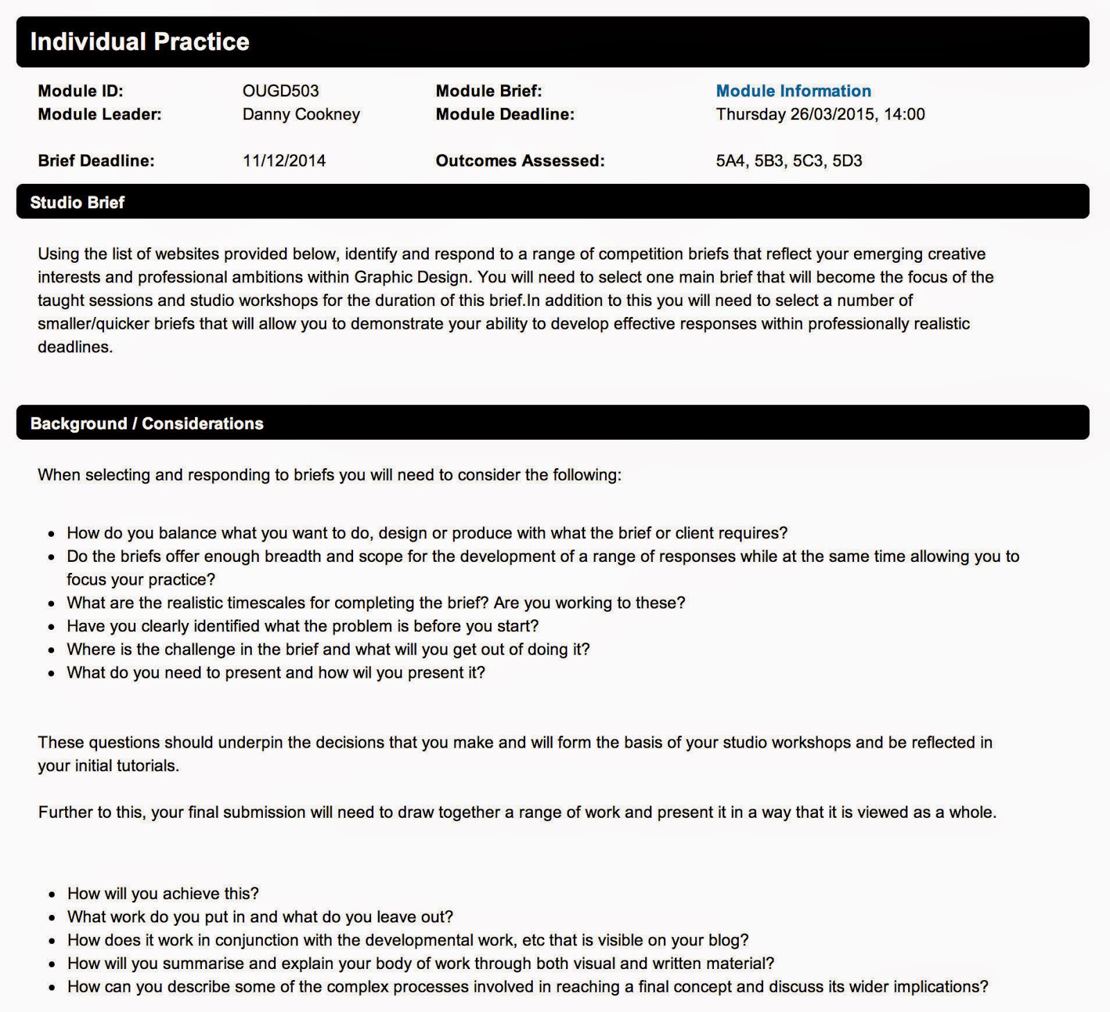
☞ The Haven House project was launched in 2004 but few media have been developed around this cause. A website exists, however I could see there are many gaps. I analyzed and identified several areas for improvement.

Le projet de Haven House a été lancé en 2004, cependant peu de moyens de communication se sont développés autour de cette cause. Un site existe, mais j'ai pu constater qu'il y a beaucoup de lacunes. J'ai l'ai analysé et dégagé plusieurs points à améliorer.


General appearance of the site : when I arrived on the home page, I noticed first of all that the colors were not adequate and a bit repulsive, although they relate to the theme of ecology. I was sorry that the screen space is not fully occupied. The information is so undeveloped, especially the visuals I find it important to show. Finally, the text is difficult to address because the information isn't hierarchical (no titles, no layout).

Aspect général du site : quand je suis arrivée sur la page d'accueil, j'ai noté tout d'abord que les couleurs n'étaient pas adaptées et un peu repoussantes, bien qu'elles aient un rapport avec le thème de l'écologie. J'ai trouvé dommage que l'espace de l'écran ne soit pas occupé entièrement. Les informations sont ainsi pas mises en valeur, en particulier les visuels que j'estime important à montrer. Enfin, le texte est difficile à aborder car les informations ne sont pas hiérarchisées (pas de titres, ni de mise en forme).


Logo: it's non-existent, the only sign indicating that we are on the project site is the title in the upper left, The Haven House written with the default font Times. Moreover, the choice of color from the background seems doubtful.

Logo : il est inexistant, le seul signe qui indique qu'on est sur le site du projet est le titre en haut à gauche, The Haven House écrit avec la police par défaut Times. De plus, le choix de la couleur par rapport au fond me paraît douteux.


Editing flaws : as previously said, the text is not formatted and displayed defects such as breaks unjustified lines, strange shifts like the one I illustrated. I also noticed some "bugs" on the page, there are links hidden by the main text.

Défauts d'édition : comme précédemment dit, le texte n'est pas mis en forme et apparaissent des défauts comme des sauts de lignes injustifiées, des décalages curieux comme celui que j'illustre. J'ai remarqué également des "bugs" au niveau de la page, il y a des liens caché par le texte principal.


Navigation : links between pages is hard because they are not clear. On each page, we have several choices of links that appear and disappear as we advance in the site navigation. The image above is a prime example, the list suggests returns, links to other pages, it's very confusing and I got lost pretty quickly.

Navigation : les liens entre les différentes pages se fait difficilement car il ne sont pas clairs. À chaque page, nous avons plusieurs choix de liens qui apparaissent et disparaissent à mesure qu'on avance dans la navigation du site. L'image ci-dessus est un exemple probant, la liste propose des retours, des liens vers d'autres pages, c'est très confus et je me suis perdue assez rapidement.

☞ Despite the many flaws of this site, the positives are to include: 
- It's very complete and full of information (issues, visual from project, explanation of the structure, many examples) 
- Quicktime animations that allow immersion in Haven House

Malgré les nombreux défauts de ce site, des points positifs sont à citer :
- Il est très bien fourni en informations (enjeux, visuels du projet, explication de la structure, nombreux exemples)
- Des animations Quicktime qui permettent une immersion dans une Haven House

☞ Finally it's necessary for the project to create an identity and a specific line graph that can be applied in various print and multimedia supports. Thus, the project will be developed and communicate more effectively with prospective investors and the target audience.

Il est nécessaire donc pour ce projet de créer une identité et une ligne graphique spécifique qui pourront s'appliquer dans les différents supports imprimés et multimédia. Ainsi, le projet sera mis en valeur et communiquera plus efficacement auprès des futurs investisseurs et du public concerné.